For what feels like forever, decorating a space has always followed the same unspoken rule; paint your walls a colour of your choice and keep your ceiling, skirting boards and woodwork white. But we are seeing more and more homes tear out this page in the unspoken rulebook and we simply love to see it!
In this guide, we explain what colour drenching is, how to choose the right paint shade and finish, which rooms suit the look best, and our favourite part…choosing the flooring that brings a colour drenched room together.
What is colour drenching?
Colour drenching is where every surface in a room is painted in the same colour, including the walls, ceiling, skirting boards, door frames and often the radiators and doors too. Instead of white edges breaking the room into sections, one continuous colour flows around the whole space, creating a cohesive, immersive and surprisingly calming effect.
Why is colour drenching so popular?
White ceilings and skirting boards were meant to make rooms feel bigger, but they often do the opposite. Every change of colour creates a visual boundary that reminds your eye where the room ends.
In a colour drenched room, those boundaries soften and they all blend into one. Corners blur, ceilings feel less abrupt, and awkward features like boxed-in pipes or radiators simply melt into the background. Small rooms in particular can feel more generous, not less, because the eye has nothing to snag on.
And the best bit about colour drenching? No tedious cutting in and prepping your room with masking tape before you paint it – need we say more?!
How to choose a colour for drenching
The golden rule of colour drenching is to choose a colour you could happily live inside, because that is exactly what you will be doing. A shade that looks charming on a feature wall behaves very differently when it surrounds you on all sides.
Go a touch deeper than feels safe. Mid to deep shades tend to drench more successfully than pale ones. Because the colour reflects back on itself from every surface, it reads richer and more intense than it does on a paint chart. Deep greens, plums, warm browns and inky blues are natural drenching colours because they create the enveloping, den-like feeling the trend is known for.
Think about how the room is used. Restful, low-light rooms such as snugs, bedrooms and dining rooms suit moody, saturated shades. Rooms where you spend bright, busy mornings, like kitchens, often work better in softer, earthier tones that stay warm without closing in.
Test properly before you buy. Paint always shifts with the light, and in a drenched room that shift happens everywhere at once. We would recommend trying a few contenders on different walls and watch how they change from morning to evening. It is a small step that saves a lot of second-guessing.
What is the best paint finish for colour drenching?
Finish matters more in a drenched room than almost anywhere else, because light behaves differently when it has nowhere neutral to land.
Go Matt: A flat matt finish absorbs light softly and hides the small imperfections that ceilings and older plaster tend to have. We would say to avoid silk or gloss on walls and ceilings, as the sheen highlights every bump and breaks the seamless effect you are working towards.
Choose tougher paint for hardworking rooms: In kitchens, bathrooms and busy hallways, look at paints that have been formulated to be wiped clean and to cope with steam and splashes. Your drenched cloakroom will still look freshly painted long after the novelty has worn off.
Woodwork needs its own paint: Skirting boards, door frames and radiators want a durable wood and metal paint colour-matched to your walls. An eggshell or satin finish in the same shade keeps the look cohesive while standing up to knocks and the hoover.
Which rooms are best for colour drenching?
The honest answer is almost any of them, but some rooms take to the trend especially well.
Living Room & Snugs: A classic and cosy choice. A deep plum or wine shade turns an ordinary sitting room into somewhere you genuinely want to spend winter evenings.
Bathroom & downstairs loo: This is the perfect low-risk starting point. Small rooms show off the trend brilliantly, the commitment is only a couple of litres of paint, and a jewel-toned cloakroom is always a lovely surprise for guests.
Kitchens: It might feel bold, but drenching in a warm, earthy neutral tone creates a soft, sophisticated backdrop that lets timber, stone and brass details do the talking.
Bedrooms: Create a calm sanctuary with deep, muted shades that naturally signal rest.
What flooring goes with colour drenching?
Here is the part that almost every colour drenching guide forgets. In a colour drenched room, the floor is no longer one surface among many. It is the only surface that is not painted, which makes it the natural focal point of the entire space. Choose well and the floor grounds the colour beautifully. Choose poorly and it fights with everything around it.
This is where luxury vinyl tile (LVT) and sheet vinyl flooring really earn their place. Both give you the warmth and character of natural materials with the practicality that busy homes need, and both come in designs that pair wonderfully with drenched walls.
Herringbone LVT in a colour drenched kitchen
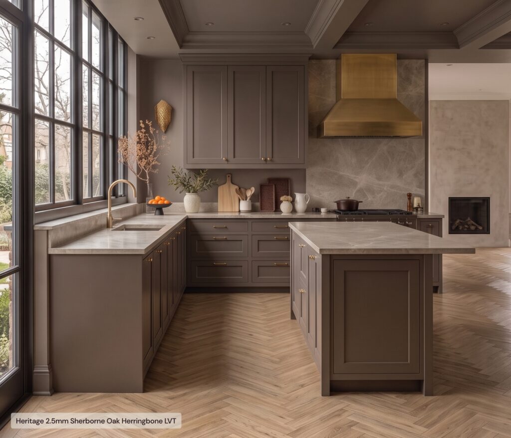
In a kitchen drenched in warm, earthy tones, an oak-effect herringbone LVT is hard to beat. The pattern adds gentle movement to a room where the walls are deliberately quiet, and the honeyed tones of the wood effect lift the deeper colour around it. Because LVT is water resistant, warm underfoot and simply clicks into place, it is a floor made for real kitchen life, spills and all.
Checkerboard vinyl in a colour drenched bathroom
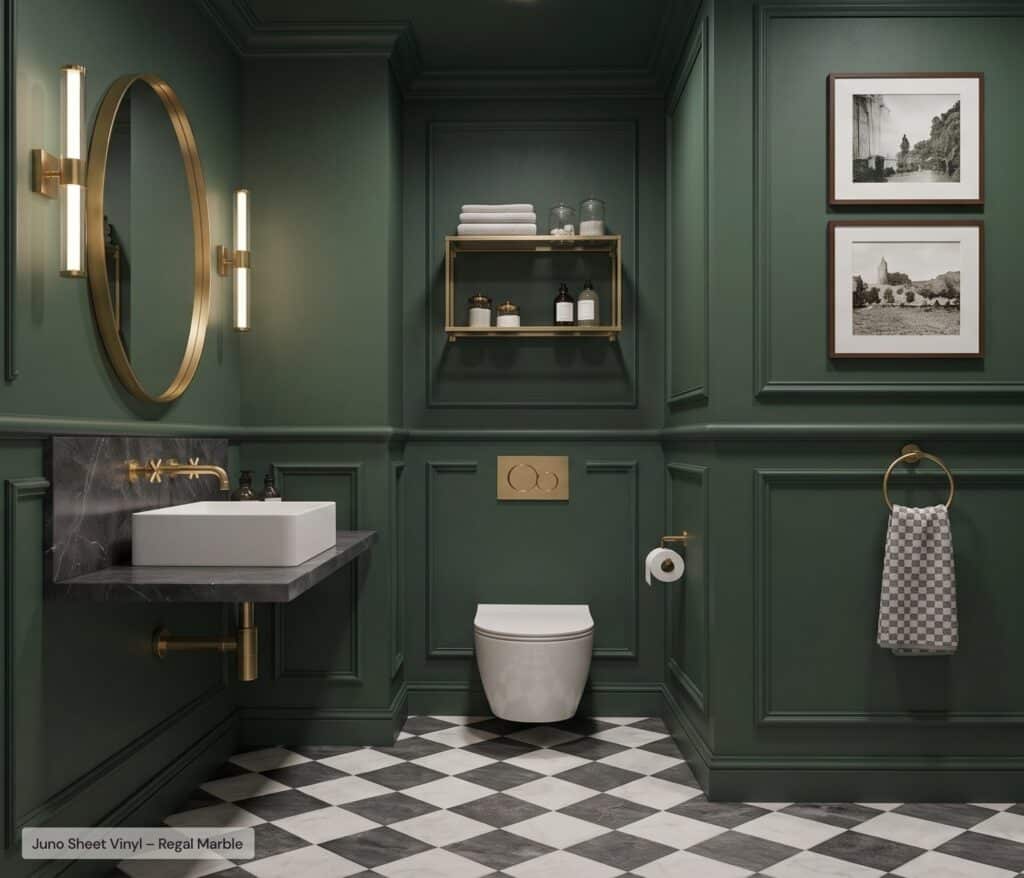
In a drenched bathroom or cloakroom, contrast is your finishing flourish. A checkerboard design in vinyl brings a touch of classic glamour to deep green walls, and the crisp geometry stops all that rich colour from feeling heavy. Sheet vinyl is a particularly clever choice in smaller wet spaces, laid in one seamless piece that keeps water exactly where it should be.
Dark wood-effect flooring in a colour drenched living room
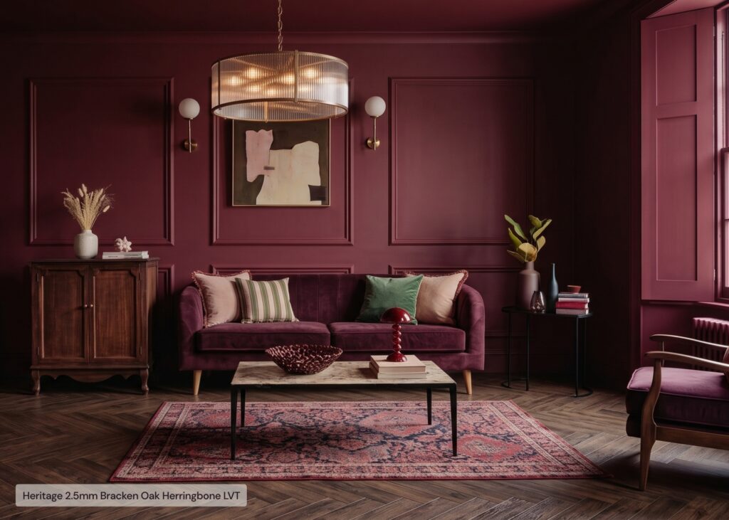
In a moody, plum drenched living room, a darker wood-effect floor keeps its nerve alongside the walls. Rather than breaking the spell with something pale, a rich walnut or smoked oak herringbone deepens the atmosphere while its natural grain and pattern stop the room from feeling flat. With built-in underlay and a forgiving surface, LVT feels comfortable and quiet underfoot, exactly right for a room built for unwinding.
A simple rule of thumb: if your walls are warm, choose a floor with warm undertones, and if your walls are cool, keep the floor cool too. Order a few flooring samples and hold them against your painted tester patches in daylight and lamplight. The right pairing tends to announce itself.
Ready to start your colour drenched room?
Colour drenching looks brave, but it is really just a decision made once and enjoyed every day after. Test your paint shades properly, choose a matt finish that lets the colour do the work, start with a room that excites you, and give the floor the consideration it deserves.
We have done the careful thinking on the flooring side, curating wood-effect LVT and sheet vinyl designs that sit happily alongside today’s richest paint shades. Order a sample or two, prop them against your painted wall, and see how the whole room comes together. Whichever way you go, you will be choosing well.
Colour drenching FAQs
Does colour drenching make a room look bigger or smaller?
Colour drenching usually makes rooms look bigger, or at least softer. Removing the contrast between walls, ceiling and skirting takes away the hard lines that tell your eye where the room stops, so the space feels continuous rather than boxed in. Deep shades create a cosier, more cocooning feel, while lighter shades keep things airy.
Do you paint the skirting boards and ceiling the same colour as the walls?
Yes, that is the heart of the technique. Walls, ceiling, skirting, door frames and often the doors and radiators are all painted in the same shade. Use a matt emulsion on walls and ceilings and a matching eggshell or satin on the woodwork for durability.
Is colour drenching going out of style?
Colour drenching has moved beyond trend status into an established way of decorating, much like feature walls did before it. Because it is rooted in how colour and light actually behave in a room, it dates far more gracefully than pattern-led fads. Choosing a shade you love matters more than choosing the shade of the moment.
What colour flooring works best in a colour drenched room?
Match the temperature of your walls. Warm drenched shades such as plum, terracotta and earthy taupe pair best with warm-toned wood-effect floors, while cool greens and blues suit cooler or contrast floors, such as a smoked oak or a classic checkerboard. Wood-effect LVT and sheet vinyl both work beautifully because they add texture and pattern without competing with the colour.
 Free Delivery*
 Order Samples